Friday, February 27, 2009

Discourse - Looking Closer 3 - Tradition: Cliché, Prison, or Basis of Growth by Herbert Spencer

Key Points

Traditions – Accumulated Experience Passed from Generation to Generation. Provides a groundwork of restraints and rules, which can be broken, but are established with reason. Without tradition to form the base of artwork, artists will fall into unrealistic ways of thinking and planning.

Traditionalism – The negative aspects of traditions, wherein the traditions are elevated to a higher importance and used imperatively, rather than expressively.

The questioning of traditions are key to creativity but lacking any constraints, creativity will stagnate.

Innovation relieves the constraints of tradition, unfortunately, breaking the groundwork of previous lessons.

When innovation and tradition are both given respect, creativity is allowed to flourish.

Examples

http://www.designingwithtype.com/essays/images/essayCarson.gif

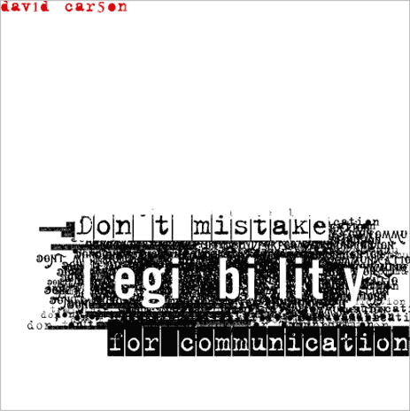
David Carson's work is often seen as an irreverent break from tradition, forgoing legibility and readability for the overall look and feel of a piece, though as this piece suggests, his focus is communication. Carson often uses to formulate his pieces in such a way that tradition is questioned. Grouping and layering text is certain against tradition, but he questions the use of readability versus communication. Many of his works attempted to visual relate the article he was designing , rather than simply present the text in organized fashion.

http://z.about.com/d/movies/1/0/T/L/6/starwars3poster.jpg

Most modern movie posters can be seen as a perfect marriage of tradition and technology. Despite the evolution of technology and viable breaks from the format, movie posters continue to resemble posters seen during the Art Nouveau era and certainly bear resemblance to the very first movie posters. Tradition imposes an acceptable format for movie posters, while still giving flexibility to the designer.http://www.me.unlv.edu/Undergraduate/coursenotes/histech/gutegbible.jpg

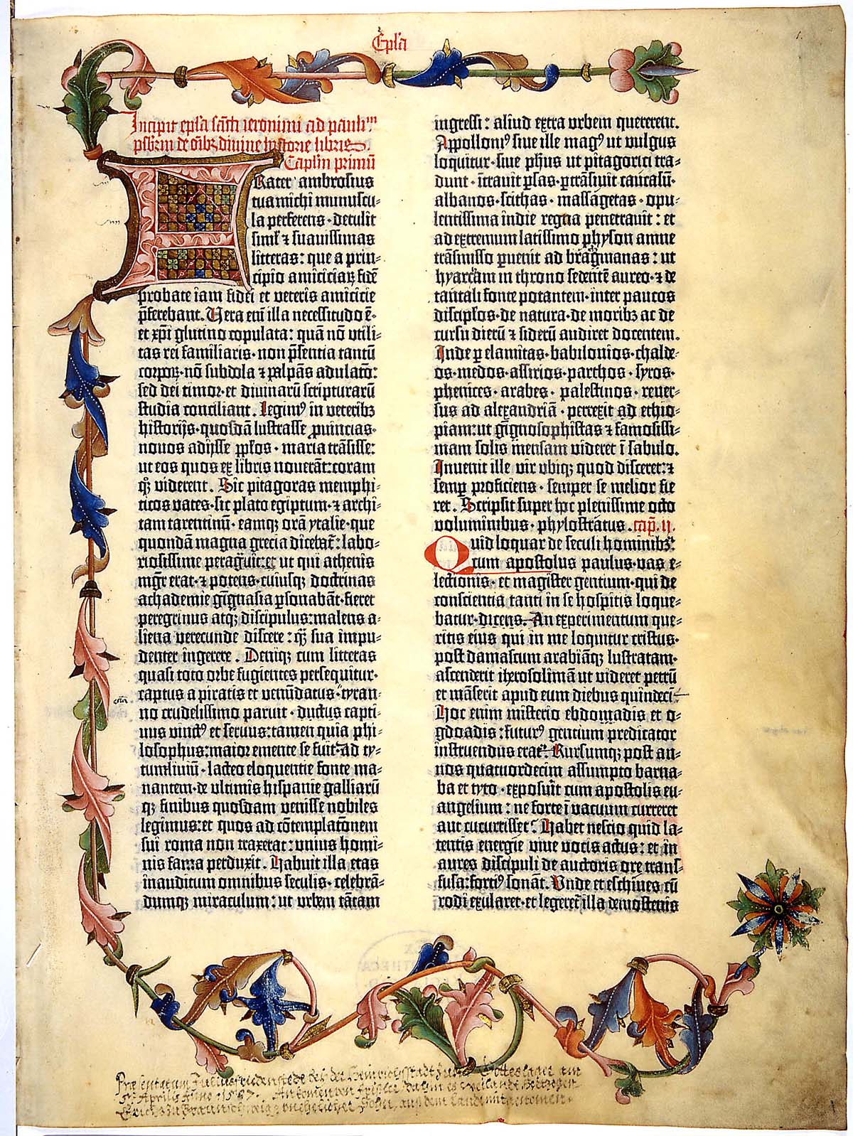
Lastly, we come to Gutenberg's bible. Despite being made long before the writing of the article I read, Gutenberg exemplifies the use of innovation and tradition. His Textura type face was designed specifically to imitate and respect the traditions of the hand-written manuscripts, while embracing and utilizing to the fullest the technology on hand.

Monday, February 23, 2009

History of Graphic Design Feb. 23th

At the turn of the century, we see the foundations of all the aspects and motivations of Modern art. It begins with Bernhard, establishing a break from naturalism and illustration with his iconicity. Through reduction of the form and typography, he laid the groundwork for professional identity and modern advertisement. Plakastil or the “poster style” took advantage of graphic simplification and the intergation of word and image. These are both ideals that we as students are taught and retaught for the entire duration of our work. The Modern world expects designers to be able to distill any object into its simplest form. Plakastil is now associated with propaganda of the World Wars, representing the Axis powers in symbolic forms, rather than the Mythical Realism of the US and England.

In reaction to the wars, DADA and Futurism form, thereby completing the reactions and counter reactions in the art world, establishing all the forms and visual imagery that would penetrate the art of the 20th century. Their entire body of work is based around the importance of signs. The linguistic sign versus the signifier and the signified. The knowledge that speech is an empty sign that has no true connection to the object that we associate with said speech allowed a break from the reverence and honor that typography had maintained for so long. Instead, the form of the type became subject to the matter and whim of the design, the poet, the artist. Suddenly, the artistic form is considered to “be” the sign, not a “representation” of the sign.

Herein, we find ourselves as modern designers, repeating the form and function of their work and pursuits. What they established as a counter movement, sacrosanct to the art of the time, is now considered to be the basics of artistic learning. The juxtaposition of signs, usually in opposition of each other, becomes the basis of design of the era. Through photomontage and surrealistic painting, the artists of the early decades of the Century infect those that follow with a duty to force the audience to question what they see.

Monday, February 9, 2009

History of Graphic Design Feb. 9th

We begin and end with Art Nouveau, a truly inspirational style and inspired movement, complete with its own reactions and counter movements inside of itself, acting as the first international style. The emphasize on organic forms and mysticism of France and England's Art Nouveau is then countered by the geometric forms and mathmatical systems of Germany and Vienna. The artist here claims complete control, setting the stage for modern graphic design. Text and im age are unified in both form and function, relying on an economical presentation of information, relying the gestalt to complete the image, allowing the audience to interpert and interact with the art itself. Cheret and Grasset usher in a balance of line, color, and space, working on what would be considered the beginning of the modern poster. This signifies the reactionary period against the reliance of mass produced industrial pieces, not polished enough to be called industrial design. Meanwhile, Gustav Klint and Peter Behrens embrace the design of the world around them, creating a language for industrial design, producing art for the people to be made quickly, taking advantage and embracing industry as a medium. Therein Art Nouveau comes full circle, making way for the "objectiveness" to follow.