Tonight, our learning was brief, covering the ideals and ideas of Deconstructionism. Not a movement so much as mode of thinking about art, deconstructionism reexamines the word image relationship in a harsh and upclose manner. Words are not meerely codes, using them is a behavoir and the behavior alters their meaning. There is no innocent speech. Every word and image used in design must be assumed to have be planned and executed.
Therein begins the the culture jam: the remixing and remaking of cultural images into citational grafts. Structures in the mass media can be reshuffled and re-inhabited, taking ads and logos and turning them to your own purposes. With this we increase the attention we pay to the role of language and "texts" in our construction of reality and identity.
This information, punctuated with videos relating to the personal experiences of artists and the related topics.
We ended the night with a discussion of a designer's role in the modern world. Ever increasingly, designers no longer work in the just the 2D printed material, but have to function in a fast paced, digital system, providing any number of design ideas on any number of projects quickly and efficently. But it's no longer the style or speed or creativity of the designer that matters, but their ability to function in a high interconnected world. Information from around the world is readily available seconds after the event occurs, and a designer has to be react and reconstitute what is happening in an active environment. Furthermore, everything comes back to you. The ethics of art is now more important than ever before, as a majority of our lives are recorded and stored for later review. Anything you do now can, and likely will haunt you for the rest of life, so make sure that the decisions you make today are the ones you want to live with.
Monday, April 27, 2009
Monday, April 20, 2009
History of Graphic Design April 20th
Tonight, the class talked entirely on Post Modernism and it's lack of defining features. Copying or appropriation is one of the defining points, as we realize that there is no more "new" ideas, simple variations of old ideas.
The video at the beginning of class spoke mostly of the highlights of Post Modernism architecture, dealing with the death of the limitations of moderism (buildings lacking ornamentation of any kind, if the hopes and aims for a streamlined modern world... to which we eventually rebel) and explode in the informed but overabudant decoration of Post Modern buildings.
Swiftly, in to the lecture, we talk about how Post Modernism is known for its extreme self inspection. Art should not be for the sake of art, but have an informed purpose and intent. Furthermore, it examines of our selves, our place, and all things socio, politcal, and cultural.
It is, in fact, a self conscious rebellion against the unified and boring vision of the future that Moderism gave us. It's formal and grid based vision is unleashed, but not into chaos, but a controlled vision.
Artists such as Paula Scher, Wolfgang Weingart, and Rosemarie all question the customs of all art styles and find that through appropriation, we can reuse and reinvent art, repurposing it for any need.
Sunday, April 19, 2009
Discourse - Looking Closer 3 - The New Typography – Moholo-Nagy
The New Typography – Moholo-Nagy
Entertaining to read, Moholo-Nagy predicts that the telephone and film would be the death of the book. He stipulates that type must be a simultaneous experience of vision and communication. No longer can type be subject the whims of the scribe, such as in Ancient Egypt. Now, the form of letter cannot be broken, for too many people rely on the legibility of those 26 letterforms. With the inception of new photographic techniques (and much later, the computer), the artist is inspired to create a new language with type, with nigh infinite variability and elasticity. However, typography is first and foremost a tool of communication. An emphasis must remain on absolute clarity. Books, being replaced by film and other forms of communication, will no longer be the main typographical image, and will be replaced by the poster.
I feel that, while dated, his belief that type would be freed by technology came true. While, some artists might take it too far, it's easy to see that the integration of expressive moving type in modern commercials.
 http://www.trollback.com/#/work/projects/151
Trollback just recently visited school and was really inspirational. His talk was exciting and showed me a step forward in Graphic Design and motion graphics. Here we see an effective use of type in motion, both interacting with the movement of the people in the piece, and the environment. The piece presents the type clearly, with an emphasis on communication and clarity, but freed from the limiting two-dimensional page.
The intro sequence to Stranger than Fiction utilizes typography in an interactive and active manner, reinforcing the spoken word without repeating it. The text in this becomes a character of its own. The type, like in the Trollback video, functions as a support to the story.
 Many professional websites out there utilize technology and typography together, but TED is one of most notable. Type is presented in a clear and distinct manner. The type here is the main character, with photography in a support capacity. The clear hierarchy of the site utilizes some of the limits of our modern technology to its advantage. The grid system in place functions well on the internet, as the basis of HTML is the table system.
Entertaining to read, Moholo-Nagy predicts that the telephone and film would be the death of the book. He stipulates that type must be a simultaneous experience of vision and communication. No longer can type be subject the whims of the scribe, such as in Ancient Egypt. Now, the form of letter cannot be broken, for too many people rely on the legibility of those 26 letterforms. With the inception of new photographic techniques (and much later, the computer), the artist is inspired to create a new language with type, with nigh infinite variability and elasticity. However, typography is first and foremost a tool of communication. An emphasis must remain on absolute clarity. Books, being replaced by film and other forms of communication, will no longer be the main typographical image, and will be replaced by the poster.
I feel that, while dated, his belief that type would be freed by technology came true. While, some artists might take it too far, it's easy to see that the integration of expressive moving type in modern commercials.
http://www.trollback.com/#/work/projects/151Trollback just recently visited school and was really inspirational. His talk was exciting and showed me a step forward in Graphic Design and motion graphics. Here we see an effective use of type in motion, both interacting with the movement of the people in the piece, and the environment. The piece presents the type clearly, with an emphasis on communication and clarity, but freed from the limiting two-dimensional page.
The intro sequence to Stranger than Fiction utilizes typography in an interactive and active manner, reinforcing the spoken word without repeating it. The text in this becomes a character of its own. The type, like in the Trollback video, functions as a support to the story.
 Many professional websites out there utilize technology and typography together, but TED is one of most notable. Type is presented in a clear and distinct manner. The type here is the main character, with photography in a support capacity. The clear hierarchy of the site utilizes some of the limits of our modern technology to its advantage. The grid system in place functions well on the internet, as the basis of HTML is the table system.
Monday, April 13, 2009
History of Graphic Design Apr. 13th
We start the night talking about Paul Rand and American Corporate Design. Besides branding products with promises, identity systems became the means of making complex organizations seem like a single entity with distinct personas. Paul Rand understood the value of invented forms for both symbolic and communicative ends, through skillful analysis of the context. Symbolic and text based logos become the basis of American Corporate Design. “Good design is good business” was the rallying cry in the graphic design community beginning in the 1950's. Branding was seen as a major way to shape a reputation for quality and reliability through “brand promise.” Paul Rand used his wit, using invented forms for both symbolic and communicative ends. Simplicity enables the viewer to interpret the context immediately.
We then move on to Bradbury Thompson. Being an adventurous spirit, he claimed that all visual forms carry history. He expanded the range of design possibilities through a thorough knowledge of printing and typesetting and interest in the vernacular of his time. The self referenced processes of printing were used as content and form.
Stepping forward into the 80s, we start to talk about Chermayeff and Geismar Associates. This Design Firm was established by Ivan Chermayeff and Tom Geismar. Their “early design office” was unified with a strong aesthetic background through educational diversity of the partners. They went on to play a major role in developing post war corporate identity in America.
No longer limited to determining graphic forms, expanded roles included large scale coordination of campaigns and value added investments in slogans, catch phrases, exhibits, and annual reports. These compact messages and expressions of design maintained a common voice by through large budgets available to design firms. Many pursued abstract forms unto themselves, free from alphabetic, pictographic, or figurative connotations.
Vignelli Associates developed Unigrid System in 1977 for the United States National Park Service. Standards for format sizes, typography, grid systems, paper specifications, and colors realized tremendous economies in material and time. Design programs so rational and so rigorously systematized that they become virtually foolproof as long as the standards were maintained. Designers embraced the ahistorical universalism of the international style that preferred abstract form over figurative references.
Herbert Matter appears in New York in the 1950's and is rapidly accepted as a godfather for Corporate Design. By the late 70's, modernism equals “mainstream” losing its political and revolutionary heritage. Design for business dulls the innovative edge as it servers new corporate masters. Corporate design – begun with Peter Berhens – sees its zenith with American design for global marketplace in the 70's and 80's.
TV is the new media being explored, which is in known for its competition for viewership. A “mediated” condition of existence and its preoccupation with “image” was the subtext of a new culture called Pop. No longer confined to a static image, pioneers of motion graphics used timing and sequence in tandem with graphic forms, typography, and photographic images.
The New Advertising (of the 50's and 60's) “The BIG Idea”
Visual statements used simple images.
Talked about intelligently to their audience.
Focus on the benefits of a product
The result was a new way to think about text and image.
Cutting edge meant sly and clever, an awareness that consumers knew they were being manipulated. Conceptual strategies for typography was unified with photography by locking text and display tightly into the photograph image. Irreverent, flippant copy and polished ironic photography sets a new tone in the industry.
The role of art director was expanded into editorial deliberations.
George Lois' concept was dominate and text and image became complete interdependent. Lois most innovative concepts grew from his ability to understand and respond to the people and events of his era.
Herb Lubalin – Photo-typography had a profound impact on the direction and look of design. Influenced advertising as well as editorial layout. Became viable with the establishment of a firm in New York 1936. The perfected technology finally allowed an expansion in the mid 50's. Provided a major advantage with the radical reduction in the cost of introducing new typefaces. Gutenburg's invention of 1450 was obsolete by the 1960's. Decorative faces had a revival which loosened the grip the “international style” had held on type design in the US.
The photo-typography provided new flexibility.
Lubalin almost single-handedly defined the aesthetic potential of photo-typography. The goal was to give graphic form to a concept or message that engaged the reader through an intensification of the message requiring active participation. Cutting edge publications push the envelope of permissiveness.
Leo Burnett – Message and image is inseparable in layout. He isolated individualism an overriding theme of the 60's era creating myths and stereotypes.
Opportunity and responsibly intermix - products of a complex system of representation. Lived experiences are replaces by symbolic expression of ideas. Social conventions and standard design thinking was challenged as new conceptual approaches emerged from the new advertising and the advent of photo-typography. Not until the 1960's did graphic design slowly become a national profession through the merging of the International Style of Typography and American corporate design with their large “image” factories.
Monday, April 6, 2009
History of Graphic Design Apr. 6th
We start talking about Isotypes tonight. Isotype is an acronym for International System of Typographic Picture Education. Isotypes began in the early Constructivist movements then Bauhaus and finally, the Isotype movement begins. Isotypes become the seed for all sorts of modern corporate graphics and sign systems. The use of simple pictographs to convey information about directions, events, and objects have complex relationships in space and time; and are usually statistical in nature. Iconic abstraction and documentary photography reports directly, gainign a cultural authority. It was familiar iconography from early Plakatstil and propaganda posters. Information designers had the power to shape public opinion.
Design systems become pervasive metaphor for design. Ladislav Sutnar represents Czech art and is one of the most ardent advocates of pure visual education in his designs and writing. Visual unit becomes the double page spread- defined for function, flow, and form. Sutnar puts forward the following priciples:
Optical interest – Visual appeal arouses attention and forces the eye to action.
Visual Simplicty of image and structure – Allow and promote quick read of comprehension of content.
Visual continuity
Herbert Bayer – Milestone in making the complex accessible. World Geography – Graphic Atlas.
Images cast off neutrality, tradition and provincialism.
American design was reflected in its culture- egalitarian with capitalistic attitudes and values.
Addison Dwiggins used term Graphic Design first in 1922
In the 1940's, one saw steps toward an original American approach to modernist design reflective of European models. Lester Beal represents the modern art movement in America. Combined Dada and reductivist methods and strategies of the type case with nineteenth century American flavor. This was all during a time where Americans, on the whole, rejected modern art, instead preferring “traditional” American art.
Lester was well read, and as such, learned the methods of Lissitzky, Bayer, and Zwart , and produced art for advertising. Paul Rand, like Lester Beal, initiated an unique American approach to graphic design, which was built on European models, but placed an emphasis on content and meaning, avoiding the promotion of pure form. Through Paul Rand, other designers came to make Modern art through imitation. He felt that it was the designers job to make the unfamiliar familiar.
Alexey Brodovitch was the Harper's art director form 1934-1958. He taught editorial designers how to use photography effectively making it the dominate tool in editorial layout. Commissioned major European artists and designers to produce work for the Harper. His editorial design shifts the American taste towards an international style of design and dependence on photography.
Photographers – Richard Avedon, Irving Penn, and Martin Munkasi.
Claude Shannon, working at Bell Labs, modeled the problem in terms of Data and Signal Processing and thus heralded the coming of the information age.
International Style was based around the need for universal communication. The Swiss grid is established at this time to fill the need to set multiple languages in a document or book. The School at ULM developed a curriculum that addresses the new needs of this age, including the study of semiotics. Semiotics was a philosophical theory of signs and symbols. The School at ULM developed symbols for designing and building electronic parts.
Swiss Design is how we finish up the evening. They saw the designer as a conduit or facilitator for delivering important information with clarity and relevancy. Further, clarity of means and form was the ideal achievement. Finally, they believed solutions emerge from the close examination of content in the most economical way.
Theo Ballmer and Max Bill established Swiss Design in its early formal vocabulary based on a rationalist model. They produced proportional grids for structuring visual form in every detail. Swiss Design claims the grid as its own. Grids provided linear divisions of space which could be divided into harmonious parts. The idea of structure and discipline guided their artistic vision.
Anton Stankowski was a major contributor in Swiss Design, with the creation of visual forms to communicate invisible processes and physical forces. Similar to later Op Art, his art relied on the idea of the unseen and vibration. He expanded design to process the information provided by the in depth research of topics from science and engineering.
This all culminates in the Basel School of Design. They essentially published the books of design that were globally accepted. While they were “functionists” they advocated suppressing the personal and elevating a systemic graphic method. The graduates spread the style to educational institutes around the world. Emil Ruder, Armin Hoffman, and Josef Muller Brockman are names majorly associated with the school.
Hoffman is known for his design philosophy based on the elemental graphic forms of point, line, and plane. His ideals dealt with the dynamic harmony of opposing forces. Contrast and motion is all figured out by mathematical formula. Brockman wrote Grid Systems, the book that is seen by some as the Bible of design. He treated imagery as objective symbols, all lessons learned from Moholy, Matter, and Bayer.
The Swiss Movement had a major impact on American Graphic Design and the emerging field of corporate graphics. Swiss Design and American Design merges after separate paths of modernist art develop. Critics of Swiss design claim it suppressed the role of context and the voice of designers producing a rigid and severe style that had inflexibility and sameness of form.
Monday, March 23, 2009
History of Graphic Design March 23rd
We start the night with Art Deco. The true synthesis of so many of the preceding art movements. Futurism, Constructivism, De Stilj, and Cubism combine to idealize and promote the future and the machine age. The engines of war slowly become consumer products, but to make the consumer like these formerly vilified devices, the artists had to promote them in a cold, unemotional detached way. The propaganda of World War I revolved around the death and destruction of human life so much, it was a challenge to get people to trust these devices. But soon, the faith in innovation was restored and the machine age of art came forward. Air France posters to advertisement for the Underground, Art Deco presented motion and expanded thinking in a visual format. With the drums of war pounding, many of the artists from all the movements that combined to form Art Deco immigrated to the United States.
With the drums of war, though, comes propaganda. The Nazi's and the Americans utilized mythic realism to promote themselves, while vilifying the enemy. The propaganda of this era remains at the idealized form of itself. I feel that even today, if you were to ask teens about war propaganda, they are more likely to cite the not so subtle of the World War II propaganda than any modern form. Granted, this was in the era when posters were the mode of communication. Today, with television, the propaganda is more successfully integrated into others forms, that without training, I feel it would be possible to be unaware of the forces acting upon you. The utilization of the icons and ideals of the enemy to demoralize the opponent and promote patriotism successfully embeds the most negative emotions of the human condition in one's head. I can still clearly imagine the poster of the children playing as the shadow of the Nazi swastika creeps over the yard in which they play. It'll likely remain in my head forever, despite the war being so distant from my generation.
Monday, March 16, 2009
History of Graphic Design March 16th
De Stijl begins this week, bringing laws of equilibrium and harmony. The most straightforward horizontal and verticals all the break down of art, divorcing the art of the De Stijl movement from the natural world. Mondrian, Rietveld, and Oud exemplify De Stijl, producing art free of representation, based solely on form. Architecture and furniture exist merely as the meeting planes in space, pure form.
Swiftly, we move in to Bauhaus, the focus of the evenings discussion, and the school that breaks artists free of the master/apprentice constrictions, producing the first of many schools of art and design to come. It was an Intensely visionary period - possibility for a universal design that integrated aspects of society. They produced works, declaring the distinctions between fine arts and applied arts to be nonexistent. Their furniture and products showed form following function, invoking ideas of the Arts and Crafts movement. True art pieces that united aesthetics with the use of their products.
Jan Tschichold establishes the New Typography, as he calls it. He is unique in the history of design. He brings 20th Century typographic expression based on Bauhaus theories to the public. He manages to bring the ideas and ideals together and articulate them. He goes so far to declare san serif as the Modernist typeface. Further unique, he turns on his rules and dictums, saying that they are limited in use and not nearly as universal as he once proposed.
Monday, March 2, 2009
History of Graphic Design March 2nd
The Constructivist movement also emerged in Communist Russia as Suprematism, though the Communists would be loathe to associate themselves with Constructivism due to the political environment of the times. Suprematism established a vocabulary of geometric structure and form based on the perceptual effects of color and formal juxtapositions in the early 20th century. The graphics of the time, place, and political setting used suggestion and its subculture to produce pervasive works. The art was surprisingly had a theme of equality throughout, the emphasis being equality between the sexes.
Some of the important and influential designers discussed in class were Solomon Tellingster, the Steinberg Brothers, Rodchenko, and El Lissitzky.
The Steinberg Brothers merged the usage of photomontage, montage, and design. Using illustration and other elements of design in combination with photography, they were able to produce a large body of work that provided a real world context to their messages.
EL Lissitzky is the designer we talked about the most tonight. Through his careful navigation of politics (a dangerous field for artists) he managed to bridge the gaps between Suprematism and Constructivism. Using his skills in art and his position, he established a typographic standard for the modern movement. El Lissitzky succeeds at
the first book that is built on modernist ideals. The “Isms” of Art was the establishment of the grid as the groundwork for page layout. As an artist, he saw no distinction between the 2D visual arts and the 3D. Often moving into other fields, he was capable of capturing the movement and use of pure forms in three dimensional space.
Friday, February 27, 2009
Discourse - Looking Closer 3 - Tradition: Cliché, Prison, or Basis of Growth by Herbert Spencer
Key Points
Traditions – Accumulated Experience Passed from Generation to Generation. Provides a groundwork of restraints and rules, which can be broken, but are established with reason. Without tradition to form the base of artwork, artists will fall into unrealistic ways of thinking and planning.
Traditionalism – The negative aspects of traditions, wherein the traditions are elevated to a higher importance and used imperatively, rather than expressively.
The questioning of traditions are key to creativity but lacking any constraints, creativity will stagnate.
Innovation relieves the constraints of tradition, unfortunately, breaking the groundwork of previous lessons.
When innovation and tradition are both given respect, creativity is allowed to flourish.
Examples
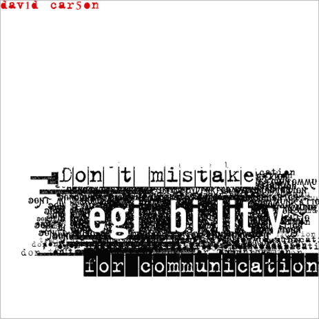
David Carson's work is often seen as an irreverent break from tradition, forgoing legibility and readability for the overall look and feel of a piece, though as this piece suggests, his focus is communication. Carson often uses to formulate his pieces in such a way that tradition is questioned. Grouping and layering text is certain against tradition, but he questions the use of readability versus communication. Many of his works attempted to visual relate the article he was designing , rather than simply present the text in organized fashion.

Most modern movie posters can be seen as a perfect marriage of tradition and technology. Despite the evolution of technology and viable breaks from the format, movie posters continue to resemble posters seen during the Art Nouveau era and certainly bear resemblance to the very first movie posters. Tradition imposes an acceptable format for movie posters, while still giving flexibility to the designer.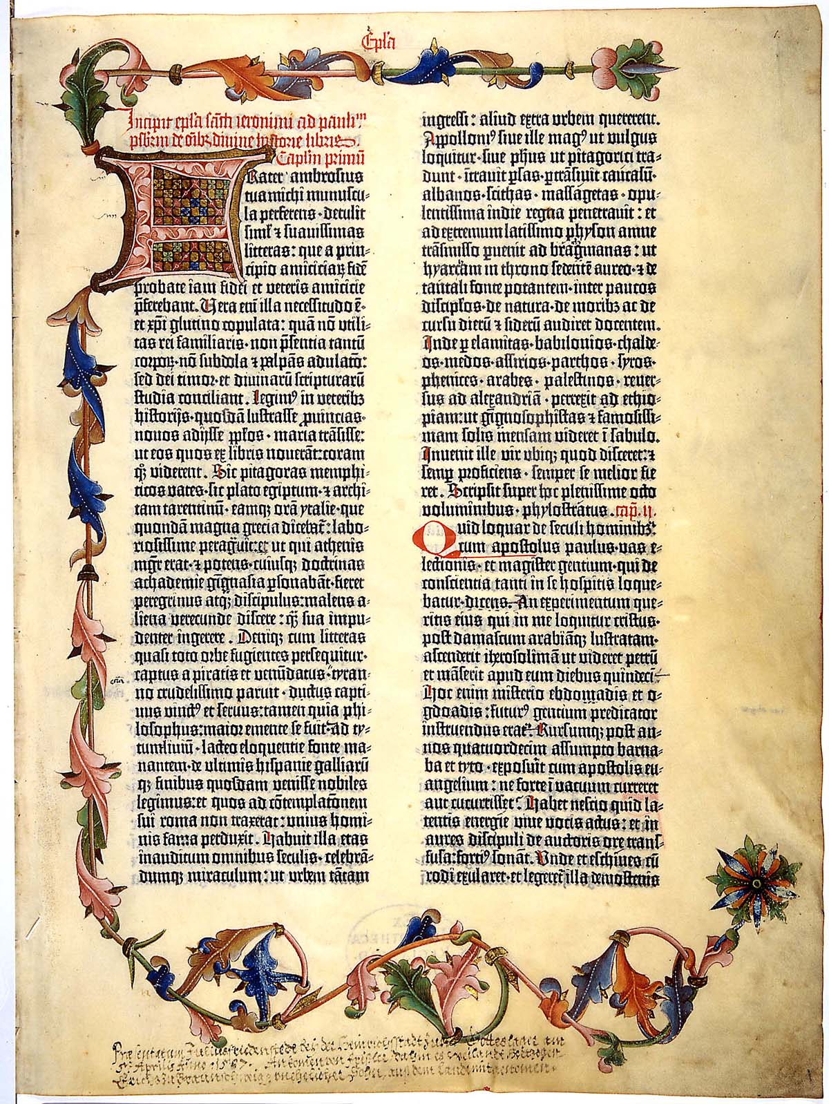
Lastly, we come to Gutenberg's bible. Despite being made long before the writing of the article I read, Gutenberg exemplifies the use of innovation and tradition. His Textura type face was designed specifically to imitate and respect the traditions of the hand-written manuscripts, while embracing and utilizing to the fullest the technology on hand.
Monday, February 23, 2009
History of Graphic Design Feb. 23th
At the turn of the century, we see the foundations of all the aspects and motivations of Modern art. It begins with Bernhard, establishing a break from naturalism and illustration with his iconicity. Through reduction of the form and typography, he laid the groundwork for professional identity and modern advertisement. Plakastil or the “poster style” took advantage of graphic simplification and the intergation of word and image. These are both ideals that we as students are taught and retaught for the entire duration of our work. The Modern world expects designers to be able to distill any object into its simplest form. Plakastil is now associated with propaganda of the World Wars, representing the Axis powers in symbolic forms, rather than the Mythical Realism of the US and England.
In reaction to the wars, DADA and Futurism form, thereby completing the reactions and counter reactions in the art world, establishing all the forms and visual imagery that would penetrate the art of the 20th century. Their entire body of work is based around the importance of signs. The linguistic sign versus the signifier and the signified. The knowledge that speech is an empty sign that has no true connection to the object that we associate with said speech allowed a break from the reverence and honor that typography had maintained for so long. Instead, the form of the type became subject to the matter and whim of the design, the poet, the artist. Suddenly, the artistic form is considered to “be” the sign, not a “representation” of the sign.
Herein, we find ourselves as modern designers, repeating the form and function of their work and pursuits. What they established as a counter movement, sacrosanct to the art of the time, is now considered to be the basics of artistic learning. The juxtaposition of signs, usually in opposition of each other, becomes the basis of design of the era. Through photomontage and surrealistic painting, the artists of the early decades of the Century infect those that follow with a duty to force the audience to question what they see.
Monday, February 9, 2009
History of Graphic Design Feb. 9th
We begin and end with Art Nouveau, a truly inspirational style and inspired movement, complete with its own reactions and counter movements inside of itself, acting as the first international style. The emphasize on organic forms and mysticism of France and England's Art Nouveau is then countered by the geometric forms and mathmatical systems of Germany and Vienna. The artist here claims complete control, setting the stage for modern graphic design. Text and im age are unified in both form and function, relying on an economical presentation of information, relying the gestalt to complete the image, allowing the audience to interpert and interact with the art itself. Cheret and Grasset usher in a balance of line, color, and space, working on what would be considered the beginning of the modern poster. This signifies the reactionary period against the reliance of mass produced industrial pieces, not polished enough to be called industrial design. Meanwhile, Gustav Klint and Peter Behrens embrace the design of the world around them, creating a language for industrial design, producing art for the people to be made quickly, taking advantage and embracing industry as a medium. Therein Art Nouveau comes full circle, making way for the "objectiveness" to follow.
Tuesday, January 27, 2009
History of Graphic Design Jan. 26th
The push from hieroglyphics to a formal standardized alphabet gives us insight into the both the limits and advantages of the written language. On one hand, we see the explosion of the Chinese logograms, with their 45,000 or more alphabet. Then we see the development of the 21 letter Phonetic alphabet, which later evolved into the 26 letter alphabet we use. We get to see the evolution of script based forms, based off the use of pens and cants, bringing us the uncial and half-uncial, and also the Rustic capitals.
After the development and standardization of the alphabet by Charlamange, we see the first typeface established by Gutenberg in the 1450s. The evolution of type follows quickly thereafter, changing from black face to the thin and delicate French influenced type of Jenson. The variation of the alphabets and the stylistic choices made then remind us how limited we are now, being bound to the forms and strokes of our alphabet, afraid to change it, less we destroy the definitive characteristics of the letterform that make it readable and understandable. Every perceivable thing is seen in printed form, evolving from a religious trademark to the standard form of communicating knowledge and standards of civilization.
Finally, we see the introduction of Romain due Roi, where we percieve the removal of the human element from the typefaces. Standardization of the serifs, strokes, and forms establish a modular form and basis for all subsquent typefaces.
Subscribe to:
Posts (Atom)
